Your Cart is Empty
Best Bedroom Colors for Sleep

Unveiling the Best Bedroom Colors for Enhanced Sleep Quality
The colors we surround ourselves with, especially in our bedrooms, can significantly influence our mood, emotional well-being, and the quality of our sleep. Our bedroom is not just a place for rest, it is a sanctuary where we relax, reflect, and recharge. The choice of colors in this intimate space is important because colors have the power to evoke emotions, affect our stress levels, and even impact our sleep patterns.
Color psychology suggests that certain hues can induce calmness, reduce stress, and promote relaxation, making them ideal for a bedroom setting. For instance, cool tones like soft blues, gentle greens, and serene lavenders are renowned for their soothing properties. These colors can lower the heart rate and reduce blood pressure, fostering an environment conducive to winding down and drifting off to sleep.
On the other hand, vibrant or bold colors such as bright reds or oranges, while energizing and stimulating in other spaces, might be too invigorating for a bedroom. These hues can increase alertness and even raise anxiety levels, potentially hindering the ease of falling asleep.
Given the profound impact colors have on our psychological and physiological states, selecting the right palette for your bedroom becomes a vital aspect of creating a restful retreat. Opting for calming bedroom colors not only enhances the aesthetic appeal of the space but also sets the stage for a more restful and restorative night's sleep, contributing significantly to overall health and well-being.
Table of Contents
- The Science of Colors for Sleep
- Top Color Choice for Sleep
- Creating a Sleep Sanctuary
- The Role of Sleepy Colors in Your Bedroom Palette
- The Influence of Calming Colors for the Bedroom
- The Most Relaxing Bedroom Colors to Consider
- How to Incorporate Relaxing Colors for Bedroom Decor
- The Psychological Impact of Soothing Colors for the Bedroom
- Colors to Avoid: What Color Is Best to Keep Out of the Bedroom
- Personalizing Your Sleep Space: How to Choose Bedroom Colors
The Science of Colors for Sleep
The psychological and physiological effects of colors on sleep are rooted in color psychology and environmental psychology, which explore how hues influence human behavior and well-being. Colors can evoke a wide range of emotional responses and have a profound impact on our physiological state, particularly in relation to relaxation and stimulation, thereby affecting our ability to fall asleep and the quality of our sleep.
Psychological Effects
Mood Influence:Colors have a profound impact on our emotions and mood. Calming colors like soft blues, greens, and lavenders are often associated with calmness and peace, promoting a relaxed mental state conducive to sleep. In contrast, vibrant colors such as reds and oranges are stimulating, increasing alertness and potentially making it more challenging to fall asleep.
Emotional Response:Colors have the power to trigger specific emotional responses. For example, blue can elicit feelings of calmness and stability, while yellow might inspire happiness and positivity. In a bedroom setting, it's beneficial to choose colors that elicit positive, calming emotions to create a comforting environment.
Perception of Space:Lighter colors can make a room feel more spacious and airy, contributing to a sense of peace and relaxation, while darker colors might create a cozy, womb-like effect that some may find comforting for sleep.
Physiological Effects
Heart Rate and Blood Pressure: The autonomic nervous system reacts to the colors in our environment, with cool tones like blue and green known to lower heart rate and blood pressure, facilitating physical relaxation. This physiological response is essential for transitioning into a restful state suitable for sleep.
Melatonin Production:The color and intensity of light can influence the body's production of melatonin, the hormone responsible for regulating sleep cycles. Warmer, dimmer colors can support melatonin production, signaling to the body that it's time to rest, whereas bright or harsh lighting can suppress melatonin, leading to difficulties in falling asleep.
The connection between certain colors and relaxation or stimulation emphasizes the importance of thoughtful color selection in sleep environments. In designing sleep environments, it's beneficial to lean towards hues that foster relaxation. Incorporating elements of your preferred calming colors, whether through paint, bedding, or decor, can transform your bedroom into a peaceful haven that supports restful sleep.
Understanding the psychological and physiological effects of colors can guide these choices, ensuring that your bedroom design not only reflects your personal style but also harmonizes with your body's natural rhythms, promoting better sleep and, by extension, enhancing overall well-being.
Top Color Choice for Sleep: Exploring the Best Color to Sleep In
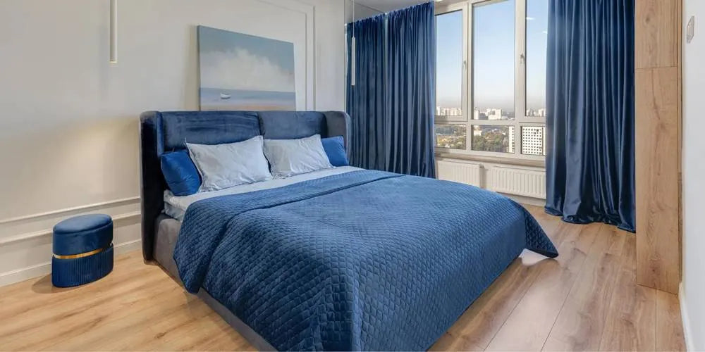
The best color for sleep, as consistently identified by research and expert opinions, is blue. This preference for blue is rooted in its profound calming effects on both the mind and body, which are conducive to restful sleep.
Why Blue Is Considered The Best:
Calming Effect:Blue is universally associated with calmness, stability, and serenity. This psychological association can help reduce stress and anxiety, creating a peaceful state of mind that's conducive to falling asleep.
Lowering Heart Rate and Blood Pressure: Physiologically, cooler shades like blue have been shown to lower heart rate and blood pressure. This physical relaxation response further supports the body's natural process of winding down for sleep.
Association with Natural Elements: Blue often reminds people of the sky and the sea, elements of nature that many find inherently soothing. This connection to nature can enhance the tranquil atmosphere in a bedroom.
Influence on Melatonin Production:While bright blue light from screens is known to suppress melatonin production, the soft, natural blue hues in a bedroom setting do not have the same effect. Instead, they contribute to an environment that supports the body's readiness for sleep.
Research Support: Studies have supported the idea that people sleeping in blue-themed rooms tend to have better sleep quality. One notable study by Travelodge examined 2,000 British homes and found that people with blue bedrooms got the most sleep, averaging 7 hours and 52 minutes of sleep per night.
The preference for blue as the optimal sleep-promoting color is backed by its ability to induce psychological and physiological states favorable for relaxation and sleep. By incorporating various shades of blue into the bedroom, through wall color, bedding, or decor, you can create an ideal sleep environment that not only looks appealing but also has tangible benefits for your sleep quality and overall well-being.
Creating a Sleep Sanctuary: Best Bedroom Colors for Sleep
Creating a peaceful and relaxing bedroom environment conducive to rest and relaxation can be significantly influenced by color choice. Beyond the widely acclaimed blue, several other hues promote a serene atmosphere by positively affecting the mind and body. Here's a range of color options suited for bedrooms that foster a serene atmosphere:
Soft Greens: Soft, muted greens, reminiscent of leafy foliage or a calm meadow, evoke feelings of nature's serenity and renewal. This color can help reduce stress and create a soothing backdrop that's conducive to relaxation and restful sleep.
Lavender and Soft Purples: Lavender and soft shades of purple have a gentle, calming effect, often associated with spirituality and mindfulness. These hues can help calm the mind, reduce anxiety, and contribute to a peaceful sleep environment.
Warm, Earthy Neutrals: Beiges, tans, and other earthy neutrals provide a warm, comforting presence in a bedroom. They offer a sense of stability and groundedness, creating a cozy retreat that's inviting and conducive to unwinding.
Pale Blues: As discussed, pale blues are incredibly effective in promoting sleep due to their calming properties. They mimic the sky's tranquil expanse, helping to lower heart rate and blood pressure, preparing the body for rest.
Soft Grays: Soft, muted grays can serve as a sophisticated, neutral backdrop that's both modern and calming. When chosen with a warm undertone, gray can add to the room's coziness without overpowering it with color, maintaining a tranquil vibe.
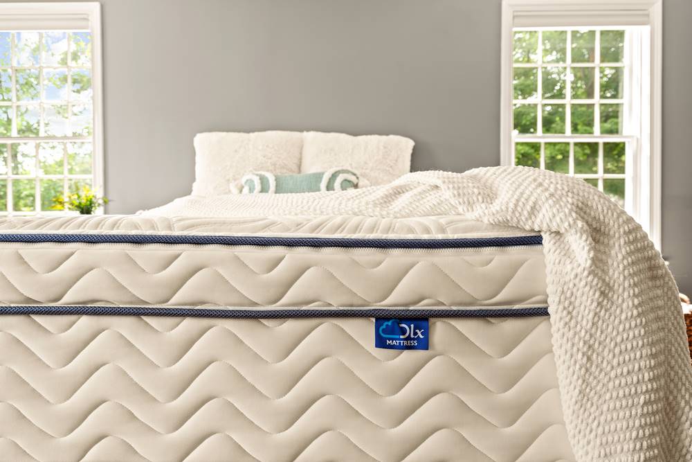
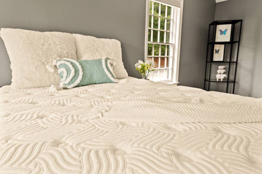
Creamy Whites: Creamy, off-white shades can make a bedroom feel open, airy, and peaceful. They reflect natural light gently, creating a soft luminosity that contributes to a calm and restful space.
Pastel Yellow: Soft, pastel yellows can bring a subtle cheerfulness to a bedroom without the stimulating effect of brighter yellows. They're often associated with happiness and can create a subtly uplifting environment that's still conducive to relaxation.
When integrating these colors into a bedroom, it's important to consider personal preferences and the overall design aesthetic. These tranquil hues can be incorporated through paint, bedding, curtains, and decorative elements to create a cohesive and serene bedroom environment. By choosing colors that resonate with tranquility and peace, you can transform your bedroom into a restful haven that supports rejuvenation and restorative sleep.
The Role of Sleepy Colors in Your Bedroom Palette
Integrating sleepy colors into the bedroom's color scheme can significantly enhance the overall ambiance and promote an environment conducive to sleep. Sleepy colors, such as soft blues, pale greens, lavender, neutral beiges, and muted grays, can contribute to a soothing and tranquil atmosphere in the following ways:
Promoting Relaxation
Sleepy colors like soft blues, gentle greens, and muted lavenders have a soothing effect on the nervous system. Incorporating these hues into the bedroom can create a peaceful environment that lowers stress and anxiety levels, making it easier to unwind and fall asleep. The psychological comfort provided by these colors can turn the bedroom into a retreat from the day's chaos, signaling to the brain that it's time to relax.
Improving Sleep Quality
Colors that evoke a sense of tranquility can also influence physiological responses, such as reducing heart rate and blood pressure, which are conducive to entering a restful sleep state. The right color palette can thus not only aid in falling asleep faster but also enhance the quality of sleep by promoting a deeper, more uninterrupted rest.
Reflecting Natural Elements
Many sleepy colors draw inspiration from nature—sky blues, earthy neutrals, and leafy greens. Integrating these hues can subtly bring the calming essence of the outdoors inside, fostering a connection with nature that many find inherently relaxing. This biophilic design approach can enhance the room's ambiance, making it feel more open, airy, and peaceful.
Aesthetic Harmony and Personal Comfort
Beyond their calming effects, sleepy colors contribute to the aesthetic harmony of the space. A cohesive color scheme that includes serene hues can make the bedroom feel more put together and intentional, contributing to a sense of personal comfort and satisfaction. This emotional connection to the space can further enhance the feeling of relaxation and readiness for sleep.
Versatility and Adaptability
Sleepy colors offer a versatile palette that can easily adapt to changing decor styles or personal preferences. They serve as a neutral backdrop for accent colors, patterns, and textures, allowing for personalization without disrupting the tranquil vibe. This adaptability ensures the bedroom remains a restful haven even as other design elements evolve.
Incorporating sleepy colors into the bedroom's color scheme can transform the space into a peaceful sanctuary that promotes relaxation, comfort, and better sleep. By creating an ambiance that is conducive to sleep, these colors can positively impact overall sleep quality and contribute to a restful and rejuvenating sleep experience.
The Influence of Calming Colors for the Bedroom
Creating a stress-free bedroom environment is essential for promoting relaxation and quality sleep. The colors we surround ourselves with have a profound impact on our emotional and physiological states, influencing our stress levels, mood, and overall sense of well-being. Calming colors can transform a bedroom into a peaceful sanctuary, conducive to relaxation and restorative sleep.
Importance of Calming Colors in a Stress-Free Bedroom Environment
- Promoting Relaxation:Calming colors have the ability to promote relaxation, helping to reduce stress and anxiety levels, and creating a peaceful ambiance that is conducive to unwinding and rest.
- Soothing the Mind:Calming colors have the power to soothe the mind and reduce mental clutter, making it easier to unwind after a long day. Shades that evoke calmness can help lower anxiety and stress by creating a serene atmosphere that encourages relaxation.
- Enhancing Sleep Quality: A stress-free bedroom environment, created with calming colors, can contribute to better sleep quality by fostering a tranquil and inviting space for rest and rejuvenation.
Examples of Calming Colors and Their Effects
- Soft Blues: Often associated with the sky and water, soft blues are known for their calming effect on the mind. They can help create a sense of stability and serenity, making them ideal for a stress-free bedroom environment.
- Gentle Greens:Shades of green that mimic nature, such as sage or mint, can bring the outdoors in, promoting relaxation and renewal. Green is linked to balance and harmony, fostering a tranquil space conducive to unwinding.
- Muted Lavenders: Lavender and soft purples have a soothing effect, often associated with spirituality and contemplation. These hues can contribute to a calming ambiance, ideal for meditation or relaxation before sleep.
- Warm Neutrals: Beiges, tans, and soft grays can create a cozy and comforting atmosphere. These warm neutral tones offer a subtle backdrop that supports a variety of decor styles while maintaining a calm and inviting space.
- Pale Pinks:Soft, blush pinks can evoke warmth and calmness, providing a nurturing and soothing presence in a bedroom. This gentle hue can add a touch of tranquility without overwhelming the senses.
- Creamy Whites: Off-white shades that lean towards the warmer side of the spectrum can make a room feel bright, airy, and peaceful. These hues reflect natural light softly, contributing to a serene and spacious feel.
The Most Relaxing Bedroom Colors to Consider
Creating a relaxing bedroom environment conducive to sleep involves carefully selecting colors that promote tranquility and calm. Here are some of the most relaxing colors for the bedroom, each with unique qualities that contribute to their effectiveness in fostering relaxation and sleep:
Soft Blues Soft blues are reminiscent of the sky or gentle sea, offering a soothing visual experience. Known for their calming effect, soft blues can lower stress and create a serene atmosphere. They are associated with feelings of stability and peace, which can help ease the mind into a restful state conducive to sleep.
Tranquil Greens Shades of tranquil green, such as sage, mint, or soft olive, evoke the natural world's restorative and calming qualities. Green is linked to balance, harmony, and renewal, mirroring the calming effect of nature. These shades can help reduce anxiety and promote a sense of well-being, making them ideal for a bedroom setting.
Lavender and Lilac These soft purples have a gentle, ethereal quality, providing a subtle touch of color without overwhelming the senses. Lavender and lilac are known for their soothing properties, often used in aromatherapy to promote relaxation. In a bedroom, these hues can contribute to a peaceful environment that encourages restful sleep.
Warm Neutrals Warm neutrals, including soft beiges, tans, and light browns, create a cozy and inviting space. These colors offer a sense of warmth and comfort, evoking feelings of security and ease. Warm neutrals can help create a snug retreat, ideal for unwinding and drifting off to sleep.
Pale Pinks Soft, muted pinks like blush or dusty rose add a touch of warmth and softness to the bedroom. Pale pinks have a calming effect and are often associated with compassion and nurturing. These gentle hues can foster a comforting and soothing bedroom ambiance, conducive to relaxation.
Creamy Whites Off-whites with creamy or warm undertones provide a clean, airy backdrop that reflects natural light softly. Creamy whites can make a space feel more open and serene, contributing to a peaceful atmosphere. This lightness and brightness can help calm the mind, preparing it for sleep.
Earthy Grays Soft, earthy grays with warm undertones offer a modern yet timeless appeal, serving as a sophisticated neutral. Earthy grays can provide a sense of stability and tranquility, grounding the space. When used in a bedroom, they can help create a calm, neutral environment that's conducive to winding down.
How to Incorporate Relaxing Colors for Bedroom Decor
Incorporating relaxing colors into your bedroom decor requires a thoughtful approach that balances aesthetic preferences with the need for a tranquil and restful environment. Here are some practical tips for incorporating these calming colors into the various elements of your bedroom:
Walls
Paint Choices: Consider painting your bedroom walls in a calming color like soft blue, tranquil green, or warm neutral. If you're hesitant to commit to a full room color change, try painting just one accent wall for a subtle touch of tranquility.
Wallpaper: Use wallpaper with subtle patterns in relaxing colors to add visual interest without overwhelming the space. Choose designs that mimic natural elements, such as floral or botanical patterns, in soft hues.
Bedding
Duvet Covers and Sheets: Select bedding in soft, soothing colors that complement your overall color scheme. High-quality, comfortable materials like cotton or linen in shades of lavender, pale pink, or creamy white can enhance the sense of relaxation.
Layering:Layer your bedding with throws and cushions in complementary relaxing colors for added texture and depth. This not only adds to the aesthetic appeal but also increases the comfort of your sleep sanctuary.
Accessories
Curtains:Choose curtains in calming colors that also provide adequate light blocking for better sleep quality. Soft, flowing fabrics can add to the room's serene atmosphere.
Rugs: Add a cozy rug in a tranquil color to warm up the space and provide a soft landing for your feet in the morning. This can also help to tie the room's color scheme together.
Artwork and Decor:Select artwork and decorative items that reflect the peaceful vibe you're aiming for. Nature-inspired pieces, abstract art in soft hues, or family photos in coordinating frames can personalize the space while maintaining a calm aesthetic.
Lighting
Soft Lighting: Incorporate lamps with warm, dimmable light to create a cozy ambiance in the evenings. Consider lampshades in calming colors to further soften the light and enhance the room's relaxing feel.
Textiles and Upholstery
Throw Pillows and Blankets: Use these to introduce calming colors and textures without making permanent changes. They're an easy way to experiment with different shades and find what feels most relaxing to you.
Upholstered Furniture: If you have a seating area or a bench in your bedroom, consider upholstery in relaxing colors. This not only contributes to the room's comfort but also reinforces the color scheme.
Additional Tips
Layering Colors:Mix and layer different shades of the relaxing colors to create depth and visual interest in the bedroom decor, while maintaining a cohesive and soothing palette.
Balance with Neutrals: Balance the calming colors with neutral tones such as white, cream, or light gray to create a harmonious and balanced look that promotes relaxation.
Natural Elements: Integrate natural elements such as wooden furniture, plants, or natural textiles to complement the calming color scheme and enhance the overall sense of tranquility.
The Psychological Impact of Soothing Colors for the Bedroom
The psychological impact of soothing colors is profound, particularly in their ability to lower stress levels and prepare the body for sleep. Soothing colors, often found on the cooler end of the color spectrum, such as soft blues, greens, and lavenders, possess unique qualities that can significantly influence our emotional and mental states, fostering an environment conducive to relaxation and rest.
Lowering Stress Levels
Mood Regulation: Soothing colors have a natural ability to regulate mood. Soft blues, for instance, are reminiscent of the sky and the sea, evoking a sense of calmness and serenity. This calming effect can help alleviate feelings of anxiety and stress, creating a peaceful state of mind.
Mental Clarity:Colors like tranquil greens, inspired by nature, can enhance mental clarity and rejuvenation. The association with nature's restorative qualities can help reduce mental fatigue, allowing for a clearer, more relaxed mind.
Emotional Balance: Soothing colors can help maintain emotional balance by providing a gentle visual stimulus that doesn't overwhelm the senses. This subtlety can create a harmonious environment that supports emotional well-being.
Preparing the Body for Sleep
Physiological Response: Beyond their psychological impact, soothing colors can elicit positive physiological responses. For example, exposure to calming hues can lead to a decrease in heart rate and a reduction in blood pressure, signaling to the body that it's time to wind down.
Enhancing Sleep Environment:Integrating soothing colors into the bedroom decor can transform the space into a sleep-friendly environment. The visual comfort provided by these colors can make it easier for the body to transition into a state of readiness for sleep.
Supporting Circadian Rhythms: While bright and harsh lights can inhibit the production of melatonin, the hormone responsible for regulating sleep, soothing colors can create a dimmer, more relaxed setting that supports the body's natural circadian rhythms, making it easier to fall asleep.
The psychological and physiological effects of soothing colors underscore their importance in creating a stress-free environment, particularly in spaces dedicated to rest, such as bedrooms. By mindfully incorporating these hues into our surroundings, we can foster an atmosphere that not only lowers stress levels but also naturally prepares the body and mind for a restful night's sleep. This holistic approach to color and design can significantly enhance our overall quality of life by improving our ability to relax and rejuvenate through restorative sleep.
Colors to Avoid: What Color Is Best to Keep Out of the Bedroom
Selecting bedroom colors that promote sleep while reflecting personal style and preferences involves balancing aesthetics with the psychological and physiological effects of colors. Here’s guidance on achieving a harmonious blend:
Understand Color Psychology Start by familiarizing yourself with the basics of color psychology and how different hues can influence mood and sleep. While calming colors like soft blues, muted greens, and gentle lavenders are known to promote relaxation, it's essential to consider how your personal reactions to colors align with these general principles.
Reflect on Personal Preferences Consider the colors you're naturally drawn to and how they make you feel. Your bedroom should be a space that reflects your personality and makes you feel comfortable. If you're attracted to bolder colors that may not traditionally be considered calming, think about using them in less dominant ways within the room.
Use Calming Colors as a Base For walls and large areas, opt for hues known to have a calming effect. This creates a serene backdrop that's conducive to relaxation and sleep. Soft neutrals, pale blues, or muted greens can serve as a versatile canvas for your personal style.
Incorporate Preferred Colors Through Accents Bring in your favorite colors through accent pieces, such as throw pillows, blankets, artwork, or decorative items. This approach allows you to infuse the room with your personality without overwhelming the space with stimulating colors.
Experiment with Shades and Tints If you're drawn to a color that's typically stimulating, consider using a softer shade or tint of that color. For example, instead of a bright red, you might choose a softer rose or blush tone that retains the warmth of red without its energizing intensity.
Balance with Textures and Fabrics The texture can add depth and interest to your bedroom decor. Use fabrics and materials that enhance the room's comfort and coziness, such as soft linens, plush velvets, or smooth satins, to complement your color choices and add a layer of personal style.
Test Your Choices Before committing, test paint colors on your walls and observe them at different times of day to see how they interact with natural and artificial light. This can help you gauge the true impact of the colors on your space and mood.
Create a Cohesive Look Ensure that your color choices work well together to create a cohesive look that feels intentional and harmonious. Use a color wheel or consult design resources to understand color relationships and combinations that work well together.
Embracing the Best Colors for a Sleep-Inducing Bedroom
Choosing the right colors for your bedroom is important when creating a sleep-friendly environment as it significantly impacts your overall sleep quality. The colors we surround ourselves with in our homes, particularly in our bedrooms, can influence our mood, stress levels, and physiological state, all of which play vital roles in how well we sleep.
Influence on Mood and Stress Calming colors like soft blues, gentle greens, and muted lavenders can evoke feelings of tranquility and relaxation, essential for winding down at the end of the day. These hues can help lower stress and anxiety levels, making it easier for your mind to relax and prepare for sleep.
Physiological Effects The colors in your bedroom can also have direct physiological effects, such as lowering your heart rate and blood pressure, which are conducive to entering a restful state. Cooler, soothing tones are particularly effective in creating an environment that signals your body it's time to rest.
Enhancing Your Home Environment Incorporating sleep-friendly colors into your bedroom decor not only benefits your sleep quality but also enhances the overall ambiance of your home. Your bedroom becomes a serene sanctuary within your living space, a place where you can retreat to recharge and rejuvenate. This emphasis on creating a peaceful and restful space reflects a broader understanding of the importance of sleep in our overall well-being and the role our home environment plays in supporting that.
Personalizing Your Space While the general principles of color psychology can guide your choices, personalizing your bedroom with colors that you find soothing and comforting is equally important. This personal touch ensures that your bedroom feels like a true reflection of your style and preferences, making it all the more inviting and conducive to relaxation.
Impact on Sleep Quality A bedroom that combines the principles of sleep-friendly colors with personal style elements can significantly improve sleep quality. A well-designed, calming bedroom environment encourages longer, more restful sleep, contributing to better health, improved mood, and enhanced overall quality of life.
In summary, the thoughtful selection of colors for your bedroom is more than an aesthetic decision—it's an investment in your health and well-being. By creating a sleep-friendly bedroom that reflects both the principles of color psychology and your personal tastes, you're not only enhancing the beauty of your home but also taking a significant step towards better sleep and a healthier lifestyle.
Expert Answers to Your Sleep Color Questions
What is the absolute best color for sleep, and why?
Based on research and expert opinions, the color blue is considered the best for promoting sleep due to its calming and relaxing properties. The visible light spectrum ranges from shorter to longer wavelength light, and people tend to prefer cool-toned colors with a short wavelength, such as blue, for interior spaces.
Blue is generally associated with calmness and relaxation, evoking feelings of tranquility similar to a clear sky or a calm body of water. This association with tranquility makes it an ideal color for creating a soothing sleep environment. Studies of color and language have found that blue is strongly linked to words such as “relaxed,” “safe,” “satisfied,” and “secure”. These positive emotional associations contribute to the calming effect of the color blue.
Can certain colors in the bedroom really help improve sleep quality?
Yes, the choice of bedroom colors can significantly influence sleep quality by affecting mood and relaxation levels. Different colors can evoke distinct emotional and psychological responses. Warm colors like red and orange are often associated with energy and stimulation, while cool colors like blue and green are linked to calmness and relaxation.
Calming colors, such as soft blue, pale green, and lavender, have the ability to reduce stress and anxiety levels, creating a more relaxed environment. This can be particularly beneficial for unwinding before bedtime and preparing the mind and body for sleep.
What are some calming colors for the bedroom to consider for stress relief?
Here are some hues known for their soothing effects:
Soft Blues: Reminiscent of the sky or a calm sea, soft blues are widely recognized for their serene and tranquil qualities. They can help lower stress levels and create a peaceful atmosphere.
Gentle Greens: Evoking the natural world, gentle greens like sage, mint, or olive bring a sense of balance and harmony. These shades are restful to the eye and can help promote a calming environment.
Lavender and Muted Purples: Lavender and other muted purples have a soothing effect, often associated with relaxation and tranquility. These colors can create a soft, peaceful backdrop in a bedroom.
Warm Neutrals: Beige, tan, and soft gray offer warmth and simplicity, making a space feel grounded and secure. These neutral tones can serve as a calming foundation for a bedroom.
Pale Pinks: Soft, pale pinks can add warmth and a sense of calm without overwhelming the senses. They're often associated with compassion and comfort.
Creamy Whites:Off-white shades with warm undertones can make a bedroom feel open, airy, and peaceful. They reflect light gently, contributing to a serene ambiance.
Earthy Grays: Muted, earthy grays provide a sophisticated and calming neutral that pairs well with other soothing colors, adding depth while maintaining tranquility.
Incorporating these calming colors into your bedroom, whether through paint, bedding, or decorative accents, can significantly reduce stress and create a more peaceful and inviting environment, conducive to rest and relaxation.
How do relaxing colors for the bedroom promote better sleep?
Relaxing colors contribute to better sleep through their impact on the mind and body, influencing physiological and psychological processes that are conducive to restful sleep. Relaxing colors help create a tranquil and inviting bedroom environment, free from visual stimulation that may hinder relaxation and sleep. This peaceful ambiance supports the winding down process before bedtime. By reducing visual and mental stimulation, calming colors can help quiet the mind and promote a sense of calm, making it easier to transition into a state of relaxation and prepare for sleep.
Relaxing colors contribute to better sleep by influencing both the mind and body. Their psychological and physiological impact can help promote relaxation, reduce stress, and create a tranquil sleep environment, ultimately supporting improved sleep quality and overall well-being.
Are there any colors I should avoid in my bedroom to ensure better sleep?
Certain colors may be disruptive to sleep due to their stimulating and energizing effects. Here are some colors that may be disruptive to sleep:
Bright Red:
- Impact: Bright red is an energizing and stimulating color that can increase heart rate and blood pressure, making it less conducive to relaxation and sleep.
- Alternative: Soft, muted shades of red or pink can provide warmth without the stimulating effects, promoting a sense of comfort and relaxation.
Vibrant Orange:
- Impact: Vibrant orange can be too stimulating for the bedroom environment, as it is associated with energy and excitement.
- Alternative:Subtle peach or coral tones can offer a softer, more calming alternative to vibrant orange.
Bold Yellow:
- Impact: Bold yellow can be too bright and energizing for a sleep-conducive environment, potentially hindering relaxation and promoting alertness.
- Alternative:Soft, pastel yellows or warm, buttery tones can provide a more soothing and calming alternative to bold yellow.